Inside UN Move to Correct World Map That Makes Africa, Kenya Look Smaller
Share
The United Nations General Assembly has backed an African-led push for a world map that more accurately reflects the size of continents, giving fresh momentum to efforts to show Africa in its true proportion.
A resolution sponsored by Togo on behalf of the African Group was adopted on Friday, September 4, with 164 countries voting in favour, six abstaining and the United States being the only country to vote against it.
Known as the “Correct the Map” resolution, the initiative calls for greater use of map projections that represent the actual size of different regions more accurately.
The move has been strongly backed by the African Union, which welcomed the adoption as an important step towards correcting how Africa is represented on maps used around the world.
In a statement issued after the vote, African Union Commission Chairperson Mahmoud Ali Youssouf praised Togo for leading the initiative and commended African countries for maintaining a united position behind it.
“Designed in the 16th century primarily for navigation, the Mercator projection does not accurately reflect the relative surface areas of the different regions of the world and significantly understates the true size of the African continent,” Youssouf said.
Why Africa Looks Smaller on the Familiar World Map
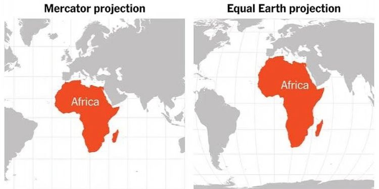
Much of the confusion comes from the Mercator projection, a type of world map created by Flemish cartographer Gerardus Mercator in 1569.
Mercator designed the map mainly to help sailors navigate. Its major advantage was that it made it easier to plot straight-line compass courses across the oceans.
The problem is that keeping those navigation features comes at a cost whereby, land areas become increasingly distorted as they move away from the Equator.
Also Read: UN Official Hails Kenya as One of World’s Most Attractive Development Partner
Countries and regions in the far north and south appear much larger than they actually are, while areas closer to the Equator, including much of Africa, appear smaller.
One of the easiest ways to understand the distortion is by looking at Greenland and Africa. On a Mercator map, Greenland can appear close to the size of Africa. In reality, Africa is about 14 times larger than Greenland.
Africa’s actual size is also difficult to appreciate from the familiar map. The continent is large enough to contain the United States, China, India, Japan, Mexico and much of Europe within its landmass, according to figures cited by supporters of the campaign.
That does not mean Mercator is a wrong map in every sense. Rather, it was created for a particular purpose and does not preserve the true relative size of land areas.
For that reason, the UN resolution does not amount to a ban on Mercator. The resolution is non-binding and does not challenge its continued use for maritime and aerial navigation, where the projection remains useful.
Equal Earth Map Gains Support as Alternative
Instead, the African-led campaign is promoting the Equal Earth projection, a map designed to show continents and countries in proportion to their actual land areas.
Unlike Mercator, Equal Earth is an equal-area projection. This means that although the shapes of some countries may look slightly different from what people are used to seeing, their relative sizes are represented much more accurately.
The campaign has been driven by Togo with support from the African Union, which endorsed the initiative in 2025.
Togo has said it wants the new approach reflected in school geography materials and is expected to work with governments, international organisations, publishers and technology companies to encourage wider adoption.
For the African Union, however, the issue goes beyond the appearance of a map.
Youssouf said the initiative highlights the importance of representing Africa according to “objective and scientifically established realities” and encouraged international institutions, education systems, publishers and digital platforms to gradually use maps that better reflect actual land areas.
“Africa must be represented as it truly is, in its true dimensions and in its rightful place in the world,” the AU Commission chairperson said.
Supporters argue that changing the maps used in classrooms, textbooks and digital platforms could help people develop a more accurate understanding of Africa’s geographical scale.
Also Read: Kenya to Host Another Global Event Months After Africa Forward Summit
The debate has also taken on a wider meaning because maps do more than show locations.
For decades, critics have argued that the familiar Mercator projection visually enlarges northern countries while making equatorial regions appear smaller.
Togo’s Foreign Minister Robert Dussey summed up the campaign’s argument ahead of the vote, telling Reuters:
“A fair world begins with a fair map.”
Still, the UN decision does not mean people will suddenly stop seeing Mercator maps or that every digital map will immediately change.
Instead, the vote gives international backing to a gradual shift towards projections that show the world’s regions more fairly by area.
Follow our WhatsApp channel for more updates.
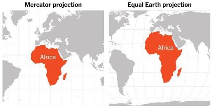
The Mercator projection (left) makes Africa appear smaller, while the Equal Earth projection (right) shows the continent’s size more accurately. PHOTO/ X